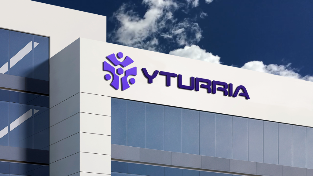
With over 75 years of experience and three generations of family leadership, we at Yturria sought to elevate our brand and give it a fresh, modern update. Moving away from an outdated look that resembled an automotive brand, we embarked on a transformative journey to revamp our visual identity. The original visual identity, with its metallic blues and outdated colors, got a complete makeover. To ensure the new brand identity hit the mark, we took a thorough approach. We started with a custom brief, analyzed the competition, and conducted a visual communication audit. Then, we presented three design concepts, and once the winning idea was chosen, we fine-tuned everything—from typography and color palettes to symbols and mockups.
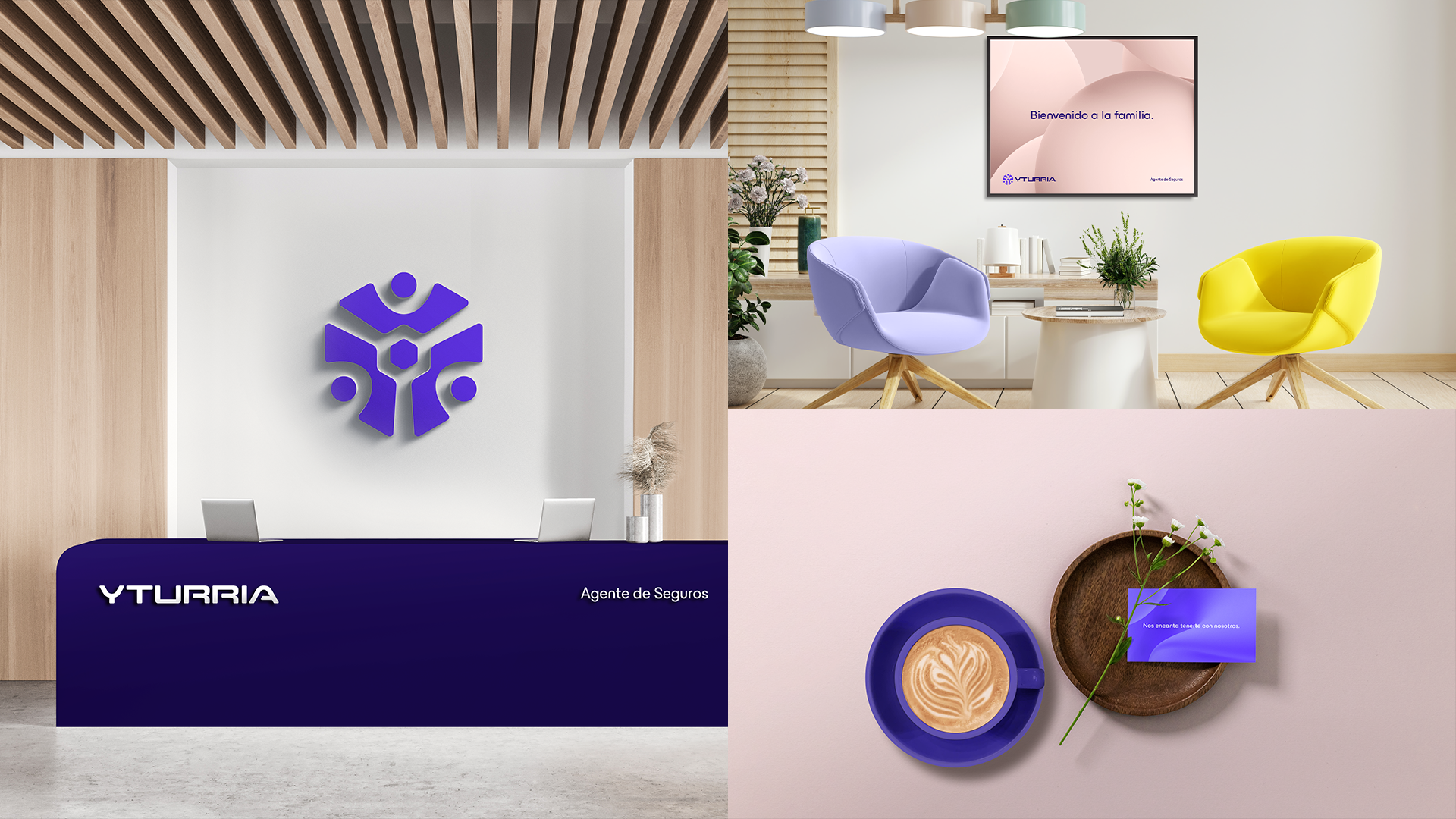
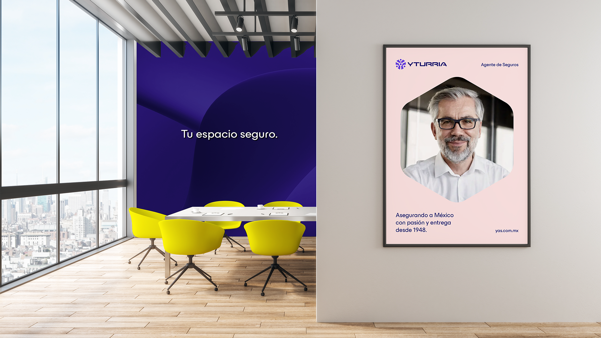
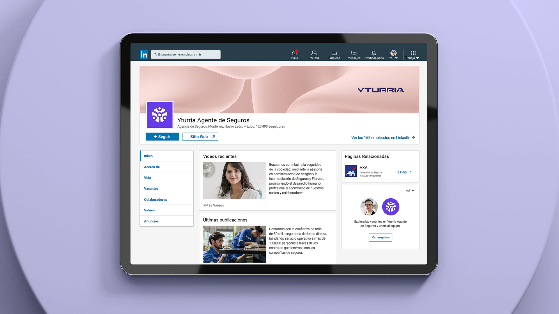
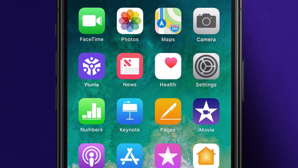
A big part of this rebranding was rethinking all the visual elements. The new color palette is fresh, warm, and deep, perfectly complementing the logo, which we crafted by hand. This logo still nods to the old design, preserving a deep connection to our brand’s history while embracing a modern direction. The typography now features soft, rounded shapes that feel approachable and contemporary, reflecting our commitment to welcoming every client just like another family member. Our visual identity was designed with a meticulous system of balanced proportions and spacing, ensuring it is both functional and aesthetically solid. Just as the logo and colors unite the past and the present, they symbolize the protection and care we extend to our clients—strong yet gentle, enduring yet adaptable.
We also created a set of textures—waves, bubbles, and petals—that visually express our brand’s promise of protection. These elements can change in color and style, always communicating the message: “Here, nothing bad will happen to you.” The hexagon, used as a key graphic element, represents protection and can be used in different ways to highlight what matters most—such as your assets, your home, your business, and your loved ones—whether it’s through texture, text, or images. The new identity is modern and sophisticated, blending blue and red into a rich, welcoming purple, with yellow highlights for a bit of extra pop.
In the end, what started as a request for a new logo turned into a full brand refresh that truly resonated with our team. Our new identity captured the warmth and family values that have always been at the heart of Yturria, making us all feel deeply connected to the brand's evolution. It rekindled a sense of pride and excitement, setting us up for a stronger presence both online and offline, while staying true to the legacy that has brought us this far.


